
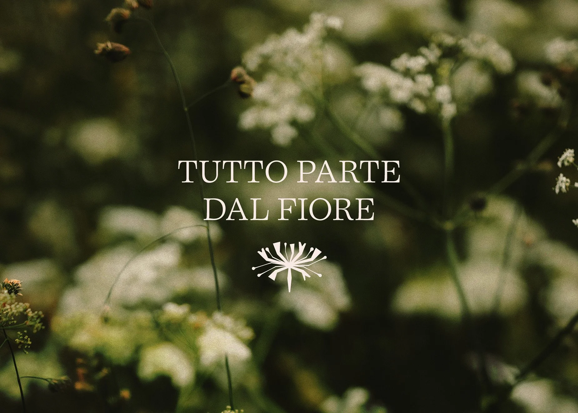
I always really enjoy working with Italian businesses; paradoxically, they present a greater challenge, a burden of responsibility that should not be underestimated.
When Silvia and Lucia contacted me, they had a clear goal in mind: they wanted to evolve.
Fiori Etruschi was (and still is) their floral design studio, but their brand had lost its relevance. Specialising in events and weddings, they wanted to move away from their overly romantic and feminine aesthetic and embrace something closer to nature, timeless and tangible.
Questionnaire and concept development.
We therefore began by analysing their questionnaire. I had asked them the usual questions (Why the name ‘Fiori Etruschi’? What is Fiori Etruschi and what sets it apart from other studios? etc.), but as they are friends and business partners, we wanted to give their brand a more personal touch. So, I also asked them to describe each other and highlight their respective strengths.
Based on their answers, we developed a range of completely different concepts, all of which stem from the same root. We explored different colour schemes and moodboards to decide which direction to take together.
As often happens, initial ideas can (sometimes, though not always, unfortunately) blend together. We therefore took the initial colour palette from project two and combined it with concept one. This was followed by the logo development phase, with three feedback sessions during which we worked together to determine the direction we wanted to take the logo and its elements.
Natural and understated minimalism.
The key word was minimalism. Silvia and Lucia didn’t want anything extravagant, baroque or trendy. We therefore opted for a clear distinction between the logo and the brand.
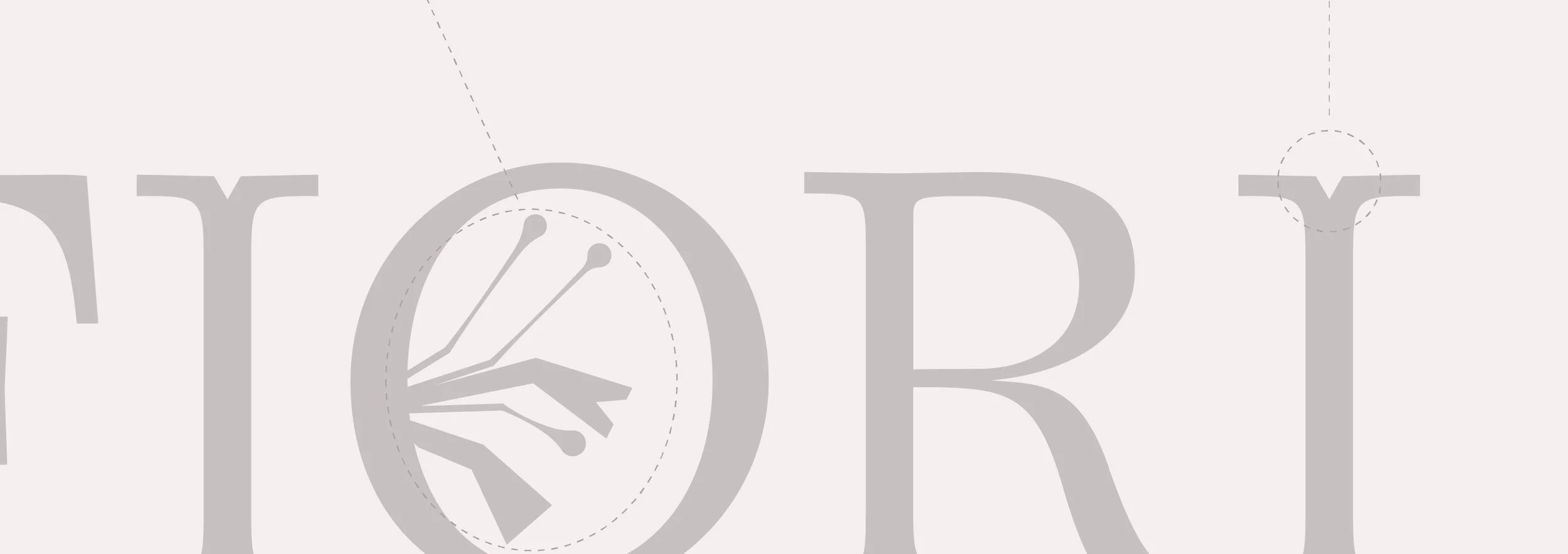
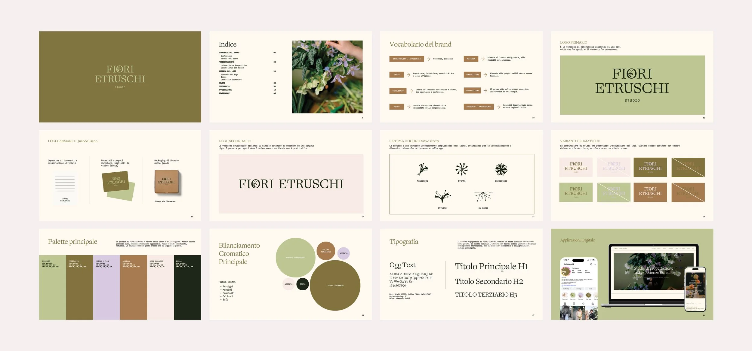
The chosen typeface had to be elegant and contemporary, but without appearing too austere. The choice of OggText was obvious and instinctive from the very start.
What could be better than a monospace typeface to bridge the gap between a ‘rustic’ brand and a serif character set?
Floral elements, icons and guidelines.
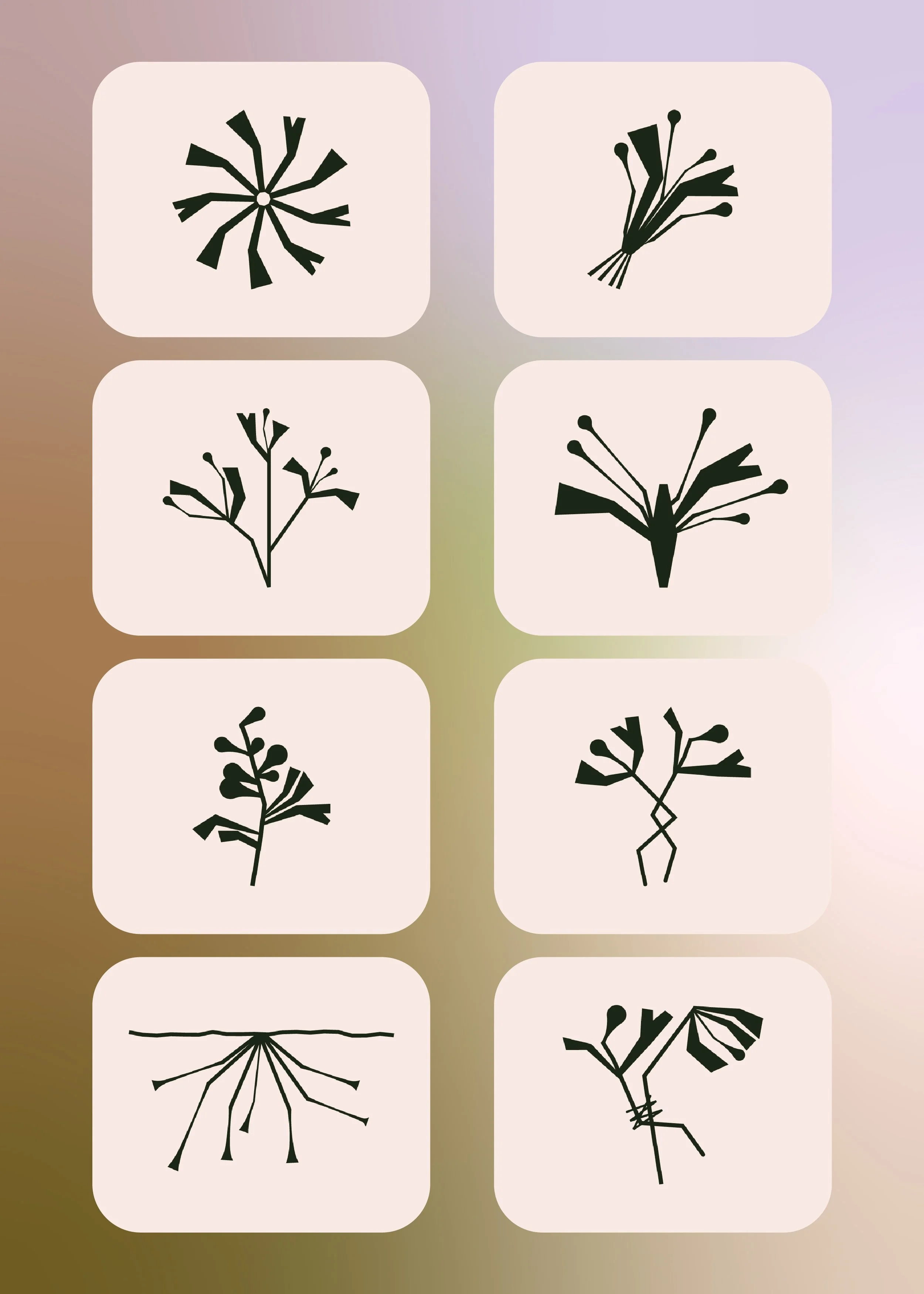
Can you think of a better way to round off the visual identity than by designing floral icons?
Whilst developing the website, we realised that the icons we’d created for social media didn’t fit as well as we’d anticipated. This wasn’t a problem at all, but rather a moment of pure creative inspiration. We got down to work and asked ourselves: How can we represent a bouquet whilst maintaining the brand’s style? And how can we visually convey the story behind the Il Campo project?
This led to the creation of roots, cut stems and simple elements which, taken together, communicate clearly; they are visually minimal yet complex (and, in fact, unique) at the same time.
Would you like to receive articles like these, along with insights and thoughts?
Subscribe to the newsletter
