
Web designing for Scarabelli1920
When my friend and colleague Leonardo from Mentastudio got in touch to ask if we could redesign the Scarabelli1920 website (a business he manages the social media for), I was absolutely delighted. Scarabelli is a carpentry company that has been in business for over a hundred years, which naturally brought with it a certain responsibility and also a challenge: to present clearly on their website the two sides of the same coin – the carpentry workshop and the project design studio.
Put like that, it may sound trite, yet for organisations as well-established and widely recognised as this, presenting something new can prove challenging at times. The aim was to preserve the original spirit, convey professionalism and expertise, whilst also raising awareness of +Studio without fragmenting the process. The project design studio emerged naturally over recent years; it is not a forced venture and does not fall outside their areas of expertise, yet it needed to be portrayed in an authentic and accurate manner.
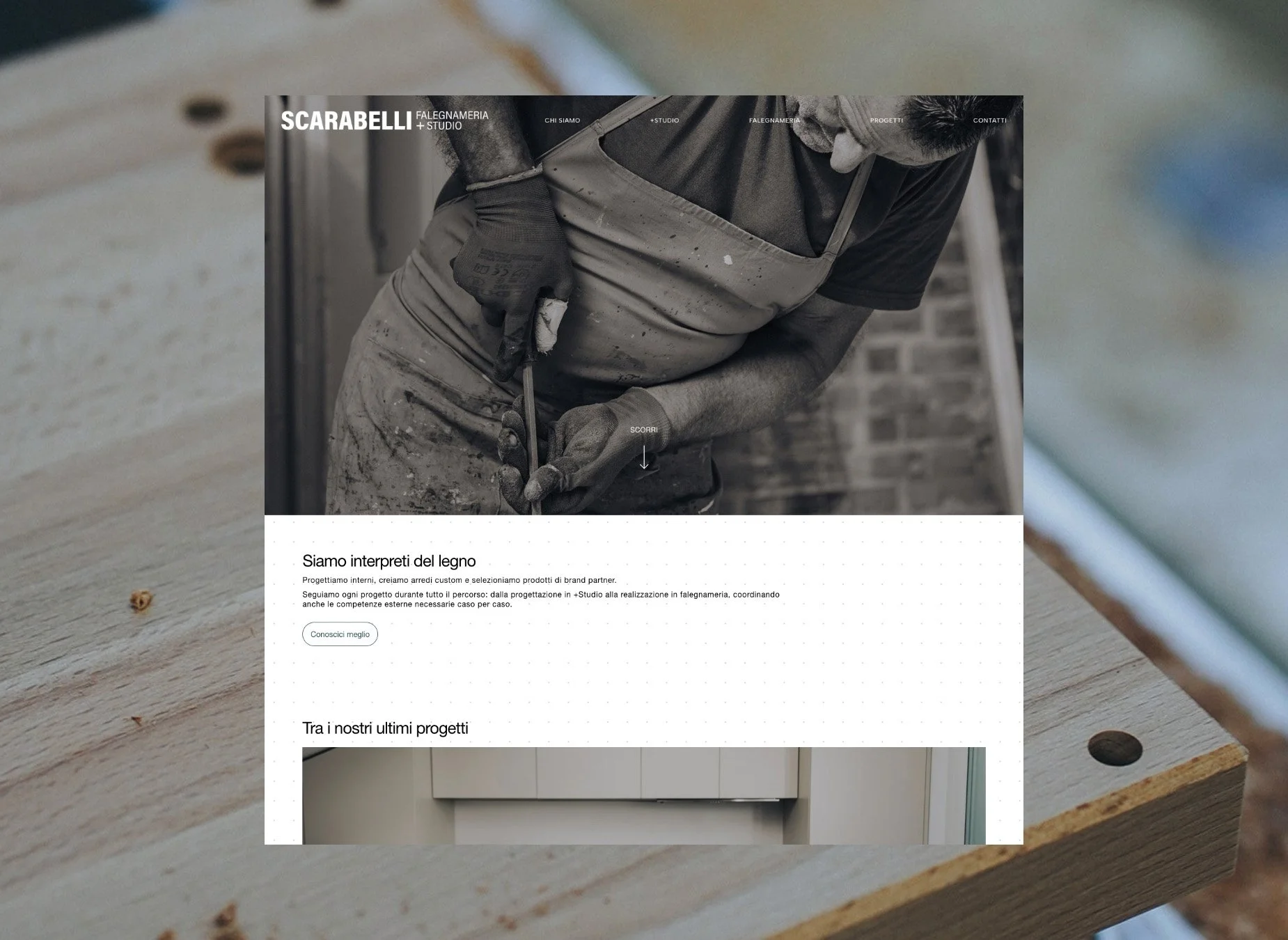
Where we started: Analysing the problem.
We therefore began by looking at the layout of the previous website – what worked and what didn’t. It was a simple, very straightforward one-page site, perhaps too basic to showcase all their services and specialisations, and a portfolio that wasn’t easy to navigate.
What we noticed immediately, and they were aware of this too, was the need for space. We needed to create and organise the space in a smart way.
When developing a website, we must always remember who we’re doing it for: the users (with the aim of the convert them into clients). It’s not just a visually appealing portfolio that’s a pleasure to browse; it must also be practical, useful, organise all the information into a logical hierarchy, and strike the right balance between text and images.
How can we achieve all this, combining what’s needed with the project budget?
Evolution as the project progresses.
The initial concept created in Figma and the website currently online share many similarities, but also many differences. When designing something from scratch (as the website was ultimately completely overhauled), it’s normal to start with a rough draft, but then you need to know how to refine it. It’s always the idea that must adapt to the problem, not the other way round.
The importance of images.
A website is made up of sections, buttons, copy and a structure designed to guide the user. But in this case, it’s also made up of images and videos.
Let’s be clear about this: a website with a stunning UI/UX design will never look its best unless it has images that are up to scratch. That’s why part of the visual upgrade is undoubtedly down to the work Leonardo did with his camera. A professional photoshoot isn’t just a whim, but something that really makes your work stand out.
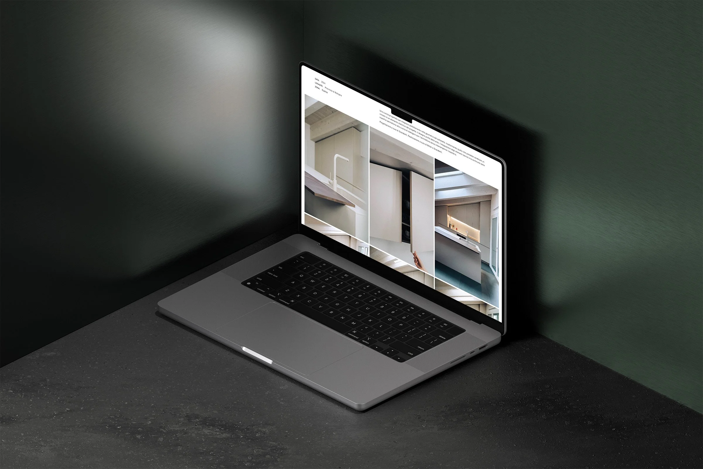
Thanks to the fantastic archive of material at our disposal, we’ve been able to play around a lot with the pictures, alternating them with videos and areas with more text.
Celebrating one’s heritage also means moving forward.
PROJECT CREDITS
Concept and development: Aire Studio
Photography and videography: Mentastudio
Copywrite editing: Aire Studio
Would you like to receive articles like these, along with insights and thoughts?
Subscribe to the newsletter
